Every day, we encounter logos of famous brands that seem straightforward at first glance. However, many of these logos are carefully crafted with hidden stories, symbols, and messages designed to convey more than meets the eye. From Amazon’s familiar smile to the mysterious allure of the Versace Medusa, each logo has a unique story to tell. Let’s explore the fascinating secrets behind some of the world’s most iconic logos.
1. Amazon: More Than Just a Smile
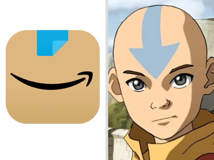
The Amazon logo is recognized globally for its simplicity and accessibility. The iconic arrow under the word “Amazon” resembles a smile, reinforcing the brand’s commitment to customer satisfaction. But did you know that the arrow also points from “A” to “Z”? This subtle detail suggests that Amazon offers a wide variety of products, essentially everything from A to Z. It’s a clever way of showing that Amazon is a one-stop shop for all your needs. The rounded design and warm color palette add a welcoming vibe, creating a logo that’s both friendly and memorable.
2. The Real Story Behind Uncle Ben’s
Uncle Ben’s logo has been a staple on supermarket shelves for decades. The face of Uncle Ben, depicted as an older black man with a bow tie, was inspired by a real person named Frank Brown. In the 1940s, Brown, a maître d’hôtel in Chicago, was spotted by the brand’s founders, who found his appearance dignified and trustworthy. They believed his image would lend an air of quality to their rice brand. While the logo has sparked discussions about racial stereotypes, it also highlights the power of personal stories in branding.
3. Tesla’s Logo: Cat Nose or Electric Inspiration?
At first glance, the Tesla logo appears as a sleek, modern “T” shape, but it has sparked varied interpretations. Some see it as resembling an IUD, a T-shaped contraceptive device, while others think it looks like a cat’s nose. However, the true inspiration is more technical. The logo is actually a stylized cross-section of an electric motor, which aligns with Tesla’s mission to revolutionize the electric vehicle industry. This design approach reflects both innovation and simplicity, key principles behind Tesla’s brand.
4. Hidden Candy in Hershey’s Kisses Logo
Hershey’s Kisses are famous for their distinctive teardrop shape and unique packaging. But there’s a hidden Easter egg in the logo itself! If you look closely, the negative space between the “K” and the “I” in “Kisses” forms a small Kiss shape, symbolizing the candy itself. It’s a subtle nod to the product that adds an extra layer of fun for observant fans. This clever use of negative space reinforces the brand and adds a playful element to the design.
5. Quiksilver’s Homage to Hokusai’s Great Wave
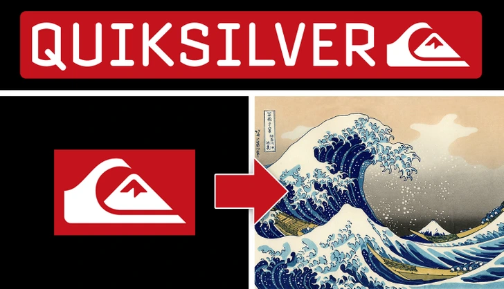
The Quiksilver logo, featuring a stylized wave with a mountain, was inspired by Japanese artist Hokusai’s famous woodcut, The Great Wave off Kanagawa. The wave symbolizes the thrill and power of surfing, while the mountain hints at the brand’s adventure-driven spirit. It reflects the brand’s identity as a pioneer in surf and outdoor lifestyle apparel. The logo is both an homage to art and a statement of the brand’s passion for the natural world, making it instantly recognizable among adventure enthusiasts.
6. Versace’s Mesmerizing Medusa
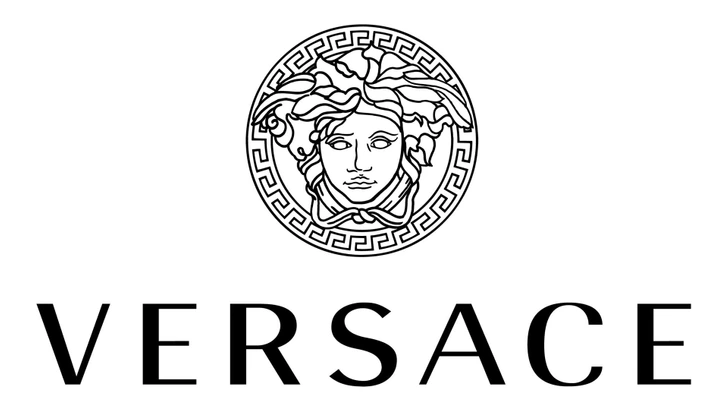
Gianni Versace’s Medusa logo is as iconic as the fashion house itself. Created in 1987, the logo depicts Medusa, the ancient Greek figure who could captivate people with her gaze. According to legend, those who looked directly at Medusa were turned to stone, a metaphor for the enchanting effect of Versace’s luxurious designs. Gianni Versace chose Medusa as his logo to symbolize the transformative power of fashion, hoping to make wearers fall in love with his creations just as people were mesmerized by Medusa.
7. Disney’s Castle and the Magic Within
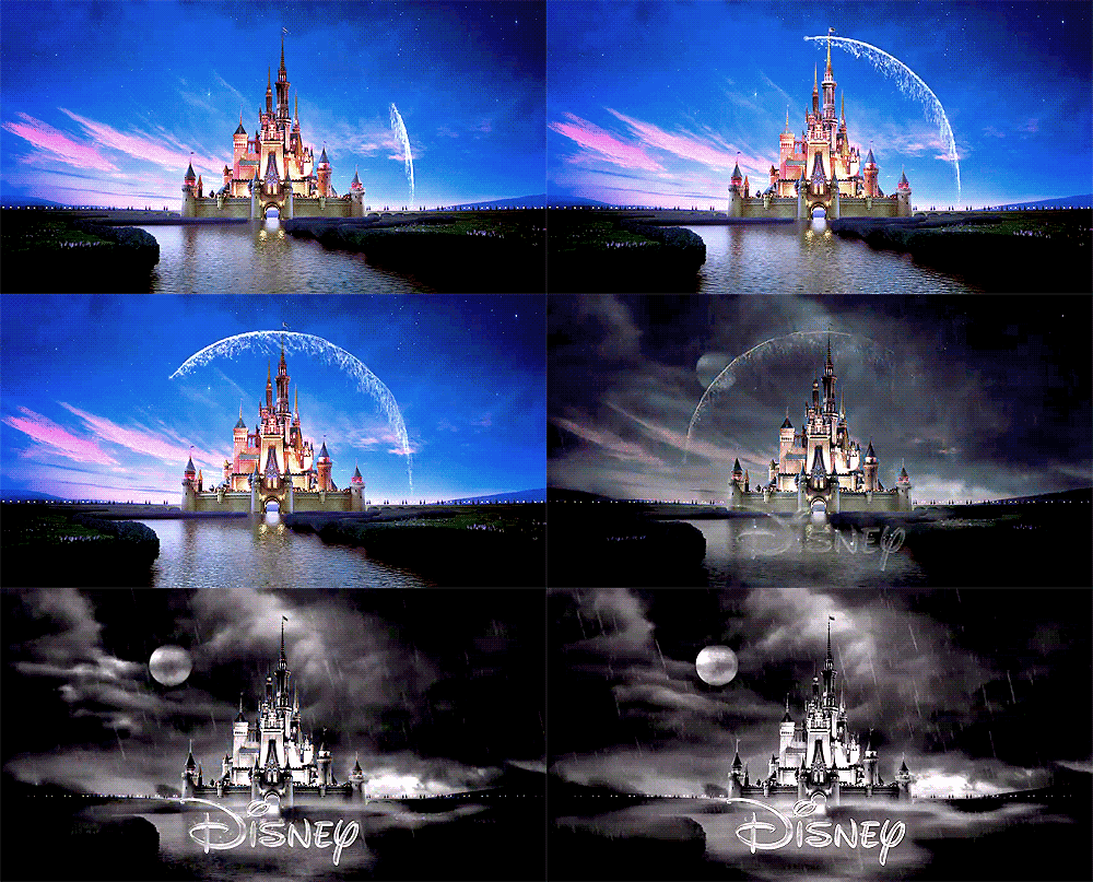
The Walt Disney Pictures logo, featuring a grand castle with a shooting star above it, is recognized worldwide as a symbol of magic and childhood dreams. The castle was inspired by Neuschwanstein Castle in Bavaria, built by King Ludwig II. This picturesque setting encapsulates Disney’s enchanting storytelling and the fairytale worlds brought to life in its movies. And the shooting star? It’s actually Tinker Bell from Peter Pan, who brings a bit of pixie dust to complete the magical atmosphere.
8. The Droste Effect in The Laughing Cow Logo
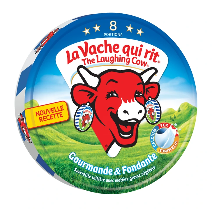
The Laughing Cow logo is unique for its use of the Droste effect, where an image contains a smaller version of itself in a recursive loop. In this case, the cow on the logo wears earrings that feature the same Laughing Cow logo, creating an endless loop. This playful, whimsical detail not only catches the eye but also highlights the brand’s cheerful and approachable image. It’s a fun element that enhances the brand’s personality and makes the logo instantly memorable.
9. NASA’s Space Meatball
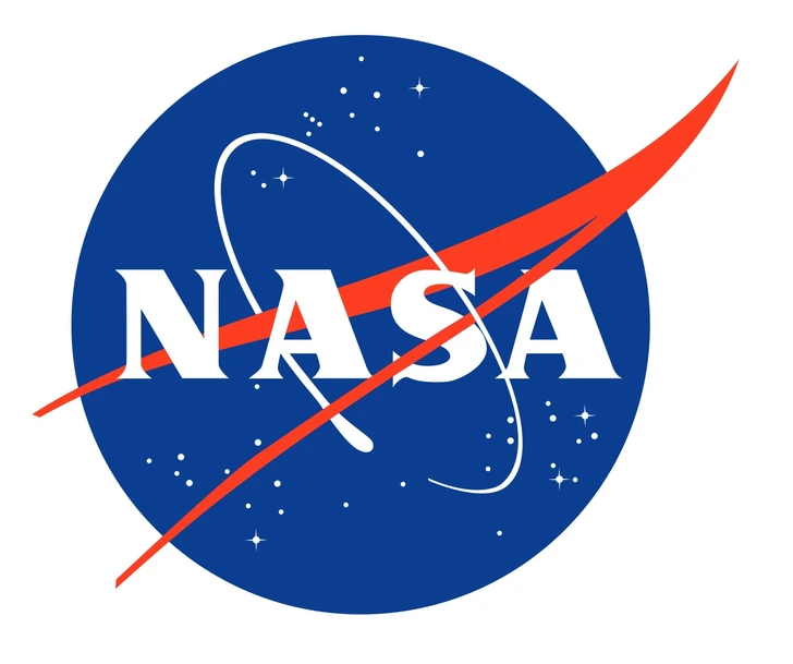
NASA’s “meatball” logo is a classic design that has become synonymous with space exploration. Created in 1959, the logo features a blue circle representing Earth, red chevrons symbolizing aeronautics, and a white spacecraft orbiting around it, all set against a backdrop of stars. The logo’s nickname, “meatball,” comes from its rounded, iconic shape. It’s a complex design that embodies the agency’s mission of exploring the final frontier, making it both inspiring and aspirational.
10. LUKoil’s Clever City Code
LUKoil, the Russian energy giant, has a name with hidden meaning. “LUK” represents the first letters of three oil-producing cities: Langepas, Uray, and Kogalym. These cities played a pivotal role in the company’s formation and growth. By encoding their names in the company logo, LUKoil pays homage to its roots, a reminder of the resources that built its empire. This subtle nod to history adds depth to the brand, underscoring its connection to the region’s rich oil reserves.
Conclusion: More Than Meets the Eye
The logos we see every day are far more than simple designs. Each logo contains hidden meanings, cultural references, and clever design elements that convey the brand’s identity, values, and story. Whether it’s Amazon’s A-to-Z message, Tesla’s electric nod, or Versace’s captivating Medusa, these logos invite us to look deeper and appreciate the artistry behind them. So next time you encounter a familiar logo, take a closer look—you might just discover a new layer of meaning hidden within the lines.
Curious about the authenticity of your favorite products? Stay tuned for our next article, where we’ll reveal tips on spotting genuine goods amidst a sea of counterfeits. Get ready to become a savvy shopper and avoid the pitfalls of knock-offs. All you need to know is coming up in the first comment below 👇
